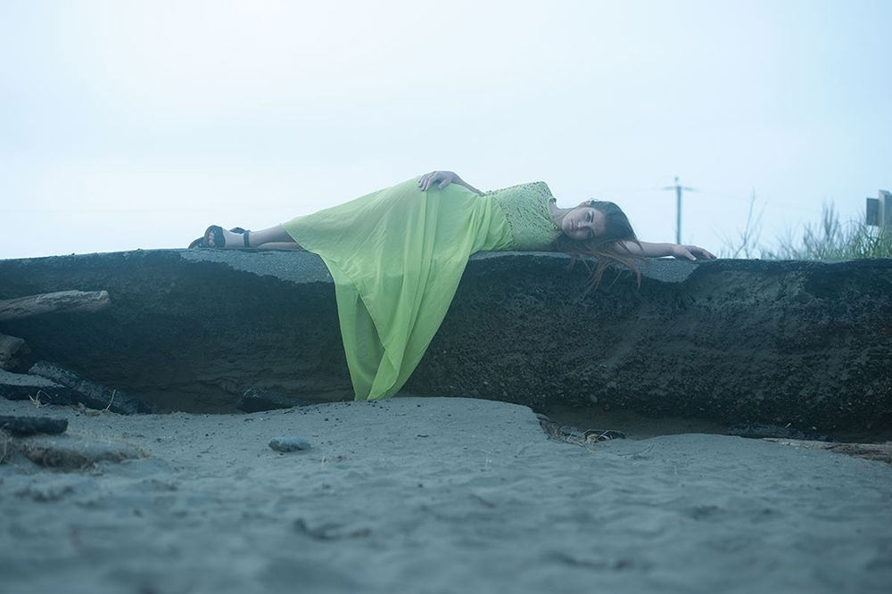
PixeLobby is a website for the education and inspiration of Digital Artists, Graphic Designers, and Photographers. Five Concepts for One Image was created as a way for Pixelobby members to get to know the founders of the group. This challenge invites all five founders (Cindy Wilkerson – CJ Wilkes Photography, Ed Ward – Mental Ward Design, Micah Burke – Micah Brannon Burke Graphic Design, Brian Mundy – Octane Media, Jesus Ramirez – The Photoshop Training Channel) to create whatever they envision from the same RAW image provided.
Each artist was given the same rules:
- Participants must use the same image (provided by Cindy Wilkerson – CJ Wilkes Photography).
- Participants must not discuss or view each others creation until it is shared here on the site.
- Participants are encouraged to share tips and tricks relative to the creation of their image.
- Participants should be as creative as they like while keeping to a G-PG13 rating.
Pixelobby.com – I am one of five founding members of pixelobby.com, an inspirational site for commercial artists and photographers with features and blogs from some of the leading talent in the digital arts industry.
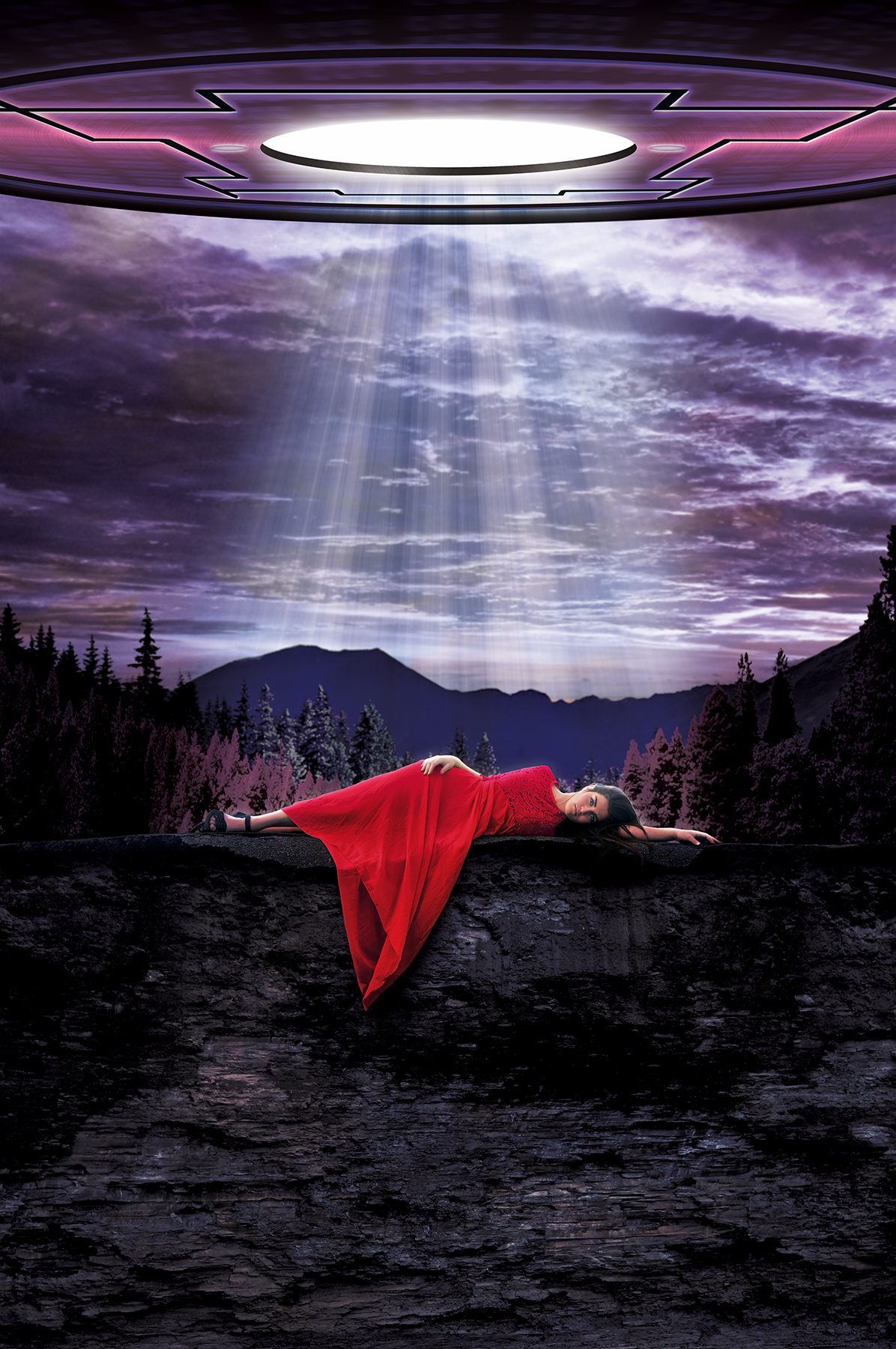
Without immediately visualizing the final direction of the piece, my initial idea was to create a big “happening” around the main subject without losing her as the focal point. The project brief suggested it would be appropriate to create an image which would give me the opportunity to explain my workflow to the Pixelobby audience. With that in mind I chose to create a piece which would feature photo compositing, color manipulation, beauty retouching, and illustration. Details in those areas are given below.
- Photoshop
Art direction, graphic design and production art from concept through completion.
First things first
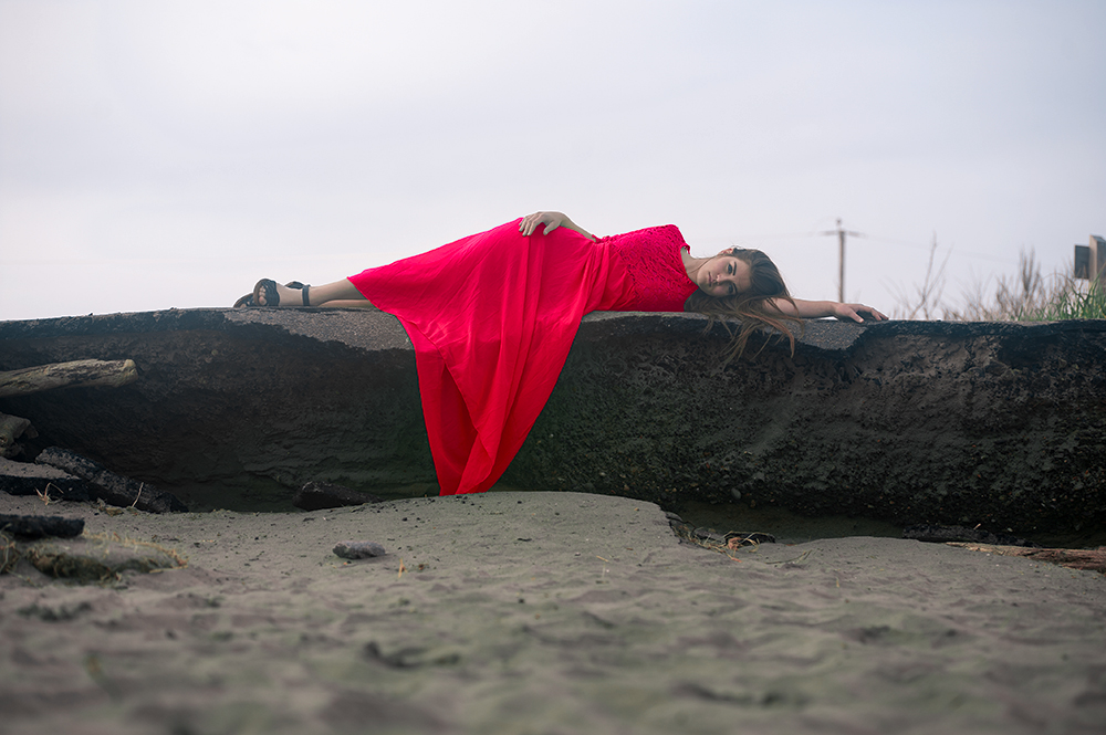
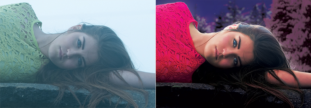
I knew that whatever “event-happening” final concept I devised, changing the color of the dress to a vibrant red would ensure that girl remained the focus of the piece. To do so I switched to the LAB color mode and using curves, made the necessary adjustments. If you’d like to know how to do this check Pixelobby’s own Jesus Ramirez’s tutorial on the subject in is PTC (Photoshop Training Channel) blog. Here’s where you’ll find it.
A Little Beauty Retouch
Next I adjusted skin tones using curves. I also brightened the eyes, lips etc and did some dodging and burning using curves as well. Then I smoothed the skin using a technique I really love. To be honest it gets lost at the final image size of this contest, and the original image itself doesn’t really have the kind of skin detail that calls for it, but since it’s such a great technique I figured I’d share it anyway right here.
It Came From Outer Space
I illustrated my spaceship from scratch in Photoshop. First I created the basic shapes. Then I used Alien Skin’s Eye Candy filter to give the elements a slight brushed metal texture. From there I simply experimented with color overlays, layer blending modes and the outer glow layer effect until I reached what I felt was a pleasing outcome. For the light rays emanating from the bottom of the craft I followed a simple tutorial created by Glyn Dewis. You can find that one right here.
